Finding the Outliers
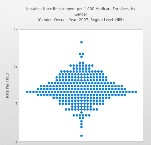
The Dartmouth Atlas of Health Care has done a great job of providing visualizations of some complex healthcare datasets released by the Centers for Medicare & Medicaid Services. While checking it out, I noticed the following graph:
Each blue dot represents a metropolitan area, and it has a value that makes it line up with the vertical axis. If you click through to the actual site, you'll note the city and the value appear when you hover over a blue dot. This unique method of presenting information makes it trivial to see who the outliers are, and also clearly exposes the distribution of values amongst the field. Note also the high data-ink ratio; there is very little on the page that doesn't convey useful information.
⸎
